Redesign of Streaming Apps for Single Course Purchasers
Client
The Great Courses
Project Type
Mobile, Tablet & OTT App
Role
Branding
Design System Creation
Creative Direction
Custom Iconography
Journey Maps
Personas
Prototypes
User Research
User Testing
UX/UI Design
Wireframes
Tools
Adobe CC
Axure RP
Glassbox
Figma
Optimal
Playbook UX
Usertesting.com
Challenge
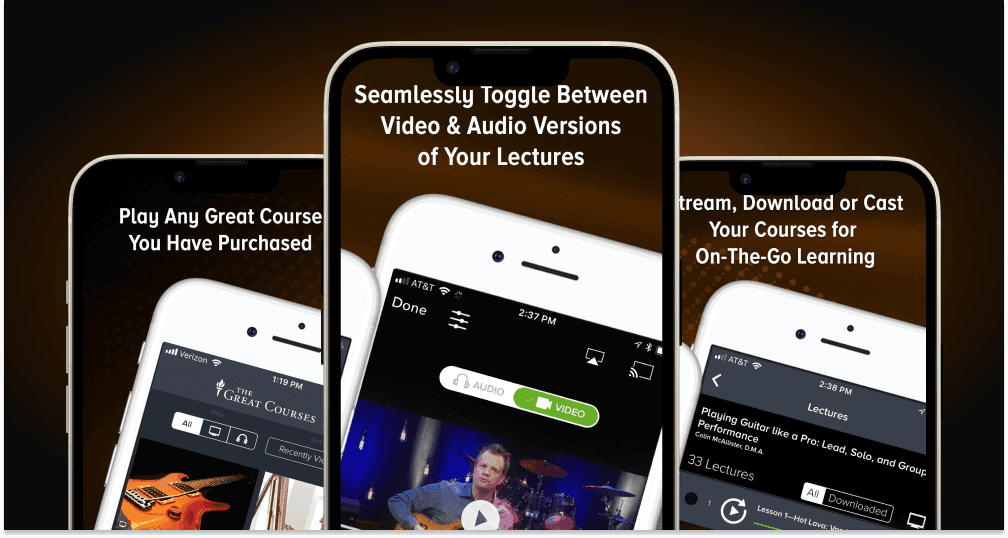
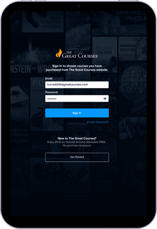
The Great Courses app was designed for users to access their purchased courses across tablets, mobile phones and OTT platforms such as Apple TV, Fire TV, Roku and Chromecast enabled devices. The mobile apps were experiencing significant usability challenges and the OTT apps were nonexistent. The mobile app's outdated interface made navigation cumbersome, leading to frequent user complaints about sign-in processes, media library management, playback issues, and difficulty in course discovery. The goal was to enhance the user experience to boost engagement and satisfaction and attract new lifelong learners. To achieve this, we undertook comprehensive user testing, conducted surveys, gathered ratings and customer feedback, and introduced methods like guerrilla testing and contextual inquiries, which were previously unexplored by TGC. These efforts aimed to pinpoint areas for improvement and guide our redesign process well before any coding began.
Results
Through meticulous redesign processes and a user-centered approach, the revamped Great Courses mobile and OTT apps successfully addressed previous deficiencies and introduced a plethora of new and enhanced features, considerably enhancing user satisfaction and engagement while attracting tens of thousands of new customers. This case study exemplifies the transformative power of thoughtful design and rigorous user testing in app redesigns and development.
85%
79%
92%
Course completion after launch
Process
Research & Analysis: To understand the needs, preferences, and pain points of current users we analyzed existing ratings and feedback, conducted several surveys and interviews with existing users, gathering valuable feedback regarding their current app experience.
User personas representing key audience segments such as professionals, students, and hobbyists were developed.
App usage data was recorded and analyzed, revealing popular features and identifying areas in need of improvement.
Competitive Analysis: To identify industry trends and best practices a detailed review of popular educational and streaming apps was performed, yielding insights into their design and feature sets.
Distinguishing features were identified and considered for adaptation and integration into the app.
Defining Redesign Objectives: To establish clear redesign goals several key performance indicators (KPIs) such as increased user retention and engagement metrics were defined.
Features were prioritized based upon business objectives, stakeholder requirements, user feedback and competitive insights.
Wireframing & Prototyping: Wireframes of main screens emphasizing user flow and intuitiveness were produced using advanced design tools such as Adobe CC, Figma and Axure.
Interactive prototypes were developed, allowing the visualization and testing of user interactions, ensuring accessibility and ease of navigation.
Usability Testing: To validate design choices we conducted vigorous user testing to observe user interactions prior to committing to a single line of code.
Usability testing sessions with robust prototypes were conducted, gathering essential feedback for iterative refinements.
User feedback helped identify pivot points and resolve any remaining usability issues.
Development & Integration: Meticulous documentation and successful collaboration with developers brought the final app version to life, ensuring optimal performance and compatibility.
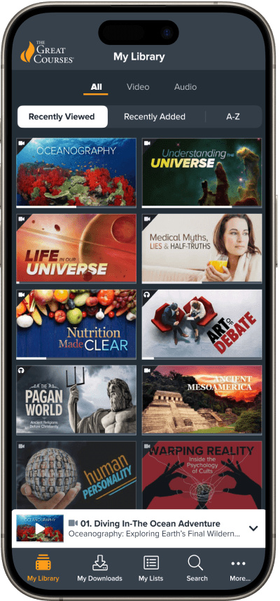
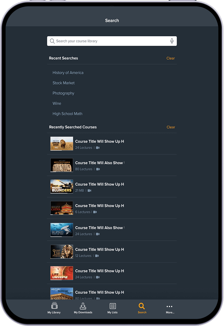
Features such as offline streaming, bookmarking, enhanced digital library, overhauled search and personalized recommendations were integrated seamlessly.
Launch and Marketing: A phased rollout was planned, allowing for feedback collection and further refinements to introduce the redesigned app to The Great Courses user base.
A strategic marketing campaign and refreshed app store assets highlighted new features and improved user experiences, attracting a wider audience.
Post-Launch Evaluation: To assess redesign success and continue improvements, user engagement and feedback were monitored, confirming the redesign's positive impact.
The app was regularly updated based on business goals, ongoing user feedback and technological advancements resulting in a significant increase in App Ratings raising from 2 to nearly 5 stars in a few short months.
Key Take Aways
Enhaced User Experience: The app's improved navigation and interface provided a more intuitive and user-friendly experience.
Increated Engagement: The introduction of new features and personalized content recommendations led to higher engagement rates and reduced churn.
Accessible Learnning: Inclusive design enhancements improved app accessibility, reaching a broader audience with diverse learning needs.
Positive Feedback: User satisfaction and positive reviews increased from barely 2-Stars to nearly 5-Stars, enhancing the app’s reputation and resulting in higher download rates.
Through these efforts, the redesign of The Great Course app successfully supported our lifelong learning customer base, while establishing it as an essential tool for new lifelong learners worldwide.
During this redesign, we created hundreds of wireframes, components, widgets, tokens, and page designs. Below is just a small selection of the overall project—please contact me should you want to view additional design samples.


Design Sytem
Our grid system features seven breakpoints, serving as the foundation for all our digital designs—from large-screen OTT apps and responsive websites, down to tablet and mobile web and app layouts in both portrait and landscape orientations. Below are examples of three breakpoints as well as a small cross section of the overall design system.

Text Scale & Text Style Samples

Icon Definitions

Button Definitions

Radio Buttons & Checkboxes

Inputs & Droplists

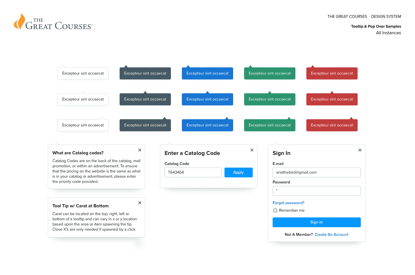
Tooltips & Popovers
Spacing Scale

Card Elevations


Chris Ward
Through meticulous redesign processes and a user-centered approach, the revamped Great Courses mobile and OTT apps successfully addressed previous deficiencies and introduced a plethora of new and enhanced features, considerably enhancing user satisfaction and engagement while attracting tens of thousands of new customers. This case study exemplifies the transformative power of thoughtful user centered, rigorous testing and research in app redesigns and development.
More Samples Available…
I am in the process of redesigning this site, and there is a lot more I can add here, but thought it was far enough along to release into the wild. Check back soon or drop me a line for more.