
Client
The Great Courses
Project Type
Responsive Website
Role
Branding
Design System Creation
Creative Direction
Custom Iconography
Journey Maps
Personas
Prototypes
User Research
User Testing
UX/UI Design
Wireframes
Tools
Adobe CC
Axure RP
Glassbox
Figma
Usertesting.com
Challenge
The Great Courses' (TGC) e-commerce site faced high bounce and low conversion rates, primarily caused by confusing navigation, unclear categorization, and a cluttered, unintuitive interface. Research revealed that users were unaware of digital course availability on the website and app, struggled with product discovery, were using the cart to save and compare courses later on, and found the checkout process cumbersome and untrustworthy. Our goal was to simplify the user journey, improve product discoverability and playback, and streamline the purchase to checkout experience to boost sales and enhance overall user satisfaction.
Results
The redesigned e-commerce site saw a 40% increase in conversion rates and a 50% reduction in cart abandonment. The newly designed, intuitive navigation, improved course categorization, overhauled search and clean interface improved product discoverability, leading to a 35% increase in average order value. Customer feedback was overwhelmingly positive both online and in-app, with satisfaction ratings rising from 1.9 to nearly 5 stars.
35%
Improved average order value
40%
Increase in conversion rate
92%
Increase in user satisfaction
Process
Leadership Buy-In: Although The Great Courses had a strong focus on multivariate testing for marketing campaigns, especially in print, practices such as user experience, user research, and user testing weren't yet commonplace. Upon taking on the UX/UI Design Manager role for the newly aligned Product team, I partnered with stakeholders across departments and leadership to champion a user-first approach, grounding decisions in real behaviors, pain points, feedback and needs rather than assumptions or top-down “cool” features.
Research & Analysis: We analyzed user behaviors and interaction patterns using tools such as UserTesting.com, SessionCam (now Glassbox), and Adobe Analytics to clearly understand typical user journeys and pinpoint critical areas of confusion or neglect. Additionally, we reviewed competitor websites and evaluated industry best practices to gather key insights and inform our redesign strategy across the board.
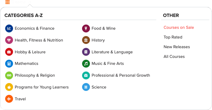
Information Architecture Overhaul: Guided by research and best practices, we restructured global navigation and mega menus around a task and topic-based taxonomy (Subjects, Skills, Goals, Instructors), clarified the category to subcategory to product hierarchy, and implemented faceted search with autosuggest, synonyms, typo tolerance, and zero‑result recovery. A robust metadata model powers category pages, instructor hubs, curated collections, learning paths, and related‑course recommendations. Product detail pages were standardized with clear value messaging, previews, reviews, and a single primary CTA (Buy Course), with transparent pricing, promotions, gifting, and corporate purchase options. We streamlined cart and checkout (guest checkout, address/payment autofill, Apple/Google Pay), added cross‑sell/upsell logic (bundles, frequently bought together), and improved account IA (Library/Owned, Saved/Wishlist, Downloads, Certificates, Order History, Billing/Receipts). Governance included SEO‑friendly URLs, breadcrumbs, componentized nav, and WCAG AA accessibility and performance targets. Measurement was operationalized via an event taxonomy, search analytics (including zero‑results dashboards), and an A/B/n and user testing roadmap to continuously improve discovery, conversion, and repeat purchase.
Wireframing & Prototyping: We began with low-fidelity wireframes and prototypes to quickly visualize layout and navigation concepts, refining them iteratively based upon user testing and feedback. Following this, we developed high-fidelity interactive prototypes to accurately simulate the final user experience and identify any potential pivot points before moving into development.
Usability Testing: We conducted usability testing sessions with a diverse set of representative users to validate our design decisions, assess task completion rates, and uncover friction points in the user experience. Employing moderated and unmoderated tests, we gathered qualitative and quantitative data on user behavior, preferences, and pain points. Leveraging these insights, we refined and iterated our designs, addressing usability challenges and optimizing critical interactions to enhance overall effectiveness, efficiency and user satisfaction.
UI Design & Design System: Collaborating with a global team of both internal talent and stakeholders as well as external specialists, we established a cohesive visual language encompassing color palettes, typography scales, iconography, and UI patterns to ensure consistency throughout the experience. Additionally, we developed a comprehensive and scalable design system, complete with reusable components, interaction guidelines, and design tokens, to streamline future design workflows and maintain a unified user experience across all digital products.
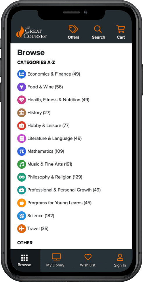
Mobile Optimization
With users previously spending just seconds on the mobile site, there was significant room for improvement. While desktop layouts translated effectively to tablet, we redesigned the mobile experience with an app-like feel by employing a bottom nav tab bar and exposing essential features such as cart and search at the top, replacing the previous burger menu system. This approach places navigation comfortably within thumb reach, simplifying access and providing clear visibility of critical functions. As a result, user engagement increased, navigation became more intuitive, and overall satisfaction improved by 92%.


Design Sytem Samples
Our grid system features seven breakpoints, serving as the foundation for all our digital designs—from large-screen OTT apps and responsive websites, down to tablet and mobile web and app layouts in both portrait and landscape orientations. Below are examples of three breakpoints as well as a small cross section of the overall design system.

Text Scale & Text Style Samples

Icon Definitions

Button Definitions

Radio Buttons & Checkboxes

Inputs & Droplists

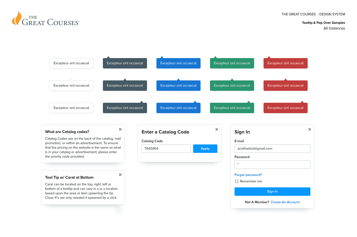
Tooltips & Popovers
Spacing Scale

Card Elevations

“With our refreshed branding, optimized product categories, enhanced shopping cart experience, and globally streamlined interface and user experience, we've significantly reduced users' time to find and purchase desired content. As a result, customers are purchasing and engaging with courses at unprecedented levels, particularly on mobile devices, where the improvement has been truly transformational.”


Chris Ward
Web Design Samples
During this redesign, we created hundreds of wireframes, components, widgets, tokens, and page designs. Below is just a selection of our work—please contact me should you like to view additional design samples.
Homepage
The homepage was redesigned to minimize visual noise and friction, guided by Hick's Law, which suggests that more choices lead to longer decision times. Previously prominent 'Deals' were consolidated into a global 'Deals Banner,' reducing distraction while remaining accessible, thus significantly boosting conversions. Both the main navigation and mega menu were streamlined for improved user-friendliness, and previously hard-to-find features were made more visible. Additionally, search functionality saw significant enhancements in both UX/UI and load time.


Accessibility
Ratings & Reviews

Global search was revamped for efficiency, offering robust features such as live predictive results broken down by courses, category and professors prior to landing on a results page. New facets and filters were added to results and category pages, while redesigned course art on product cards enabled quick visual scanning, greatly enhancing discoverability.
Search/Category Facets

Improved Browse/Mega Menu

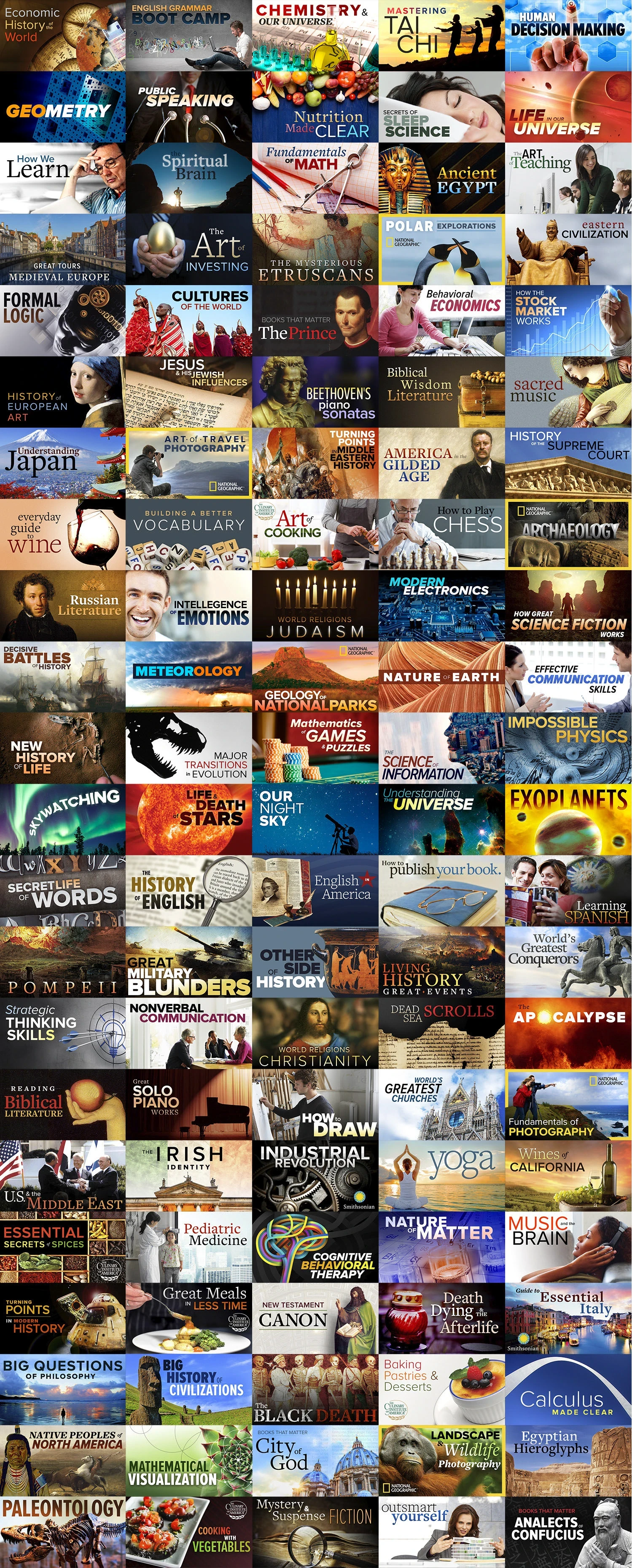
Course Title Card Redesign
Research revealed users didn't connect with the original, seemingly randomly selected course images that lacked titles on them. They were perceived as merely decoration and didn't serve much purpose. After testing new concepts with users, the redesigned course cards received highly positive feedback. My team and I successfully tackled the daunting task of creating nearly 1,000 new cards in conjunction with the site redesign, and the results speak for themselves.
Product Detail Page
To improve the product detail page, we streamlined the layout by integrating essential information into persistent 'sticky' tabbed sections, reducing page length and the need for excessive scrolling. Redesigned course image cards and revamped HD videos were added to create a more modern look and improve visual clarity. We enhanced interactivity through a collapsible lecture list, Q&A section, and refined the user review section to help build trust and increase engagement. Course set upsells were added to each product page increasing average order value while increasing customer satisfaction. The purchase process was simplified with a clear, 'sticky' call-to-action which included Wishlist and e-Gifting options – significantly boosting personalized marketing, reducing cart abandonment, and increasing conversions by over 25%.

Responsive PDP Designs


Shopping Cart
We enhanced the shopping cart experience by designing a cleaner, simplified layout to reduce friction prior to checkout. Additionally, we successfully increased the average order size by offering course transcript upsells in both digital and paperback formats directly within the cart, alongside suggestions for other highly-rated courses users could quickly add to their orders before purchasing.


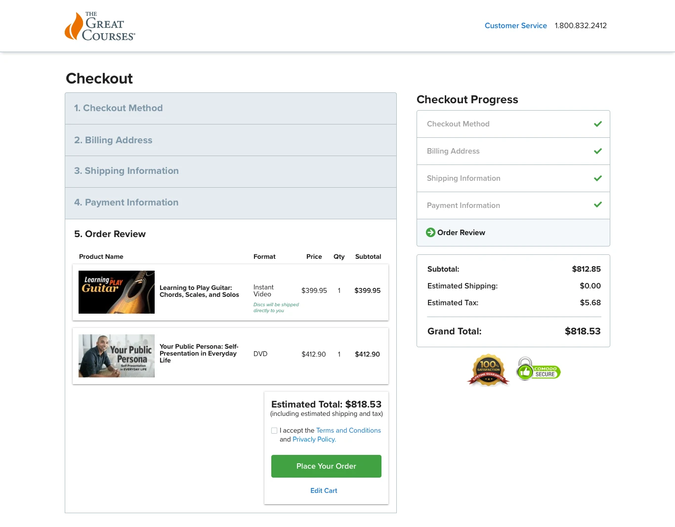
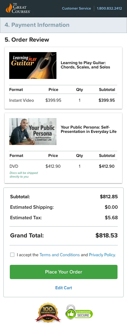
Checkout
Revamping The Great Courses responsive e-commerce website proved to be a game-changer in enhancing user experience, driving sales and increasing online course playback. By refining categories, redesigning course cards, simplifying the navigation and optimizing the checkout process, among hundreds of other improvements, we created a more enjoyable shopping experience that significantly boosted conversion rates and customer satisfaction. This project highlights the critical role of UX design in the success of e-commerce platforms.
More Samples Available…
I am in the process of redesigning this site, and there is a lot more I can add here, but thought it was far enough along to release into the wild. Feel free to view more work or request more below.