Wait Buddy
Wait Buddy was conceived as the ultimate convenience app for the modern foodie who valued their time. The app was designed to help users avoid having to wait in long lines and enjoy more quality experiences instead. The app held the user's place in line, allowing them to run errands, take a brief walk, explore nearby shops, or just relax –instead of having to stand in line or wait around in small, crowded often awkward areas.
Project Type
Entrepreneurial
Mobile App, Website, Branding
Role
Branding
Design System Creation
Creative Direction
Custom Iconography
Prototypes
User Research
User Testing
UX/UI Design
Tools
Adobe CC
Sketch
Usertesting.com
The Opportunity
The opportunity for the WaitBuddy project was to transform a functional, yet basic app into a leading lifestyle companion app for modern foodies. The challenge involved a comprehensive redesign of the app, website, and brand to enhance user engagement and create a cohesive omnichannel experience. As the entrepreneurial lead designer, my goal was to leverage my multidisciplinary design expertise to audit existing interfaces, redefine the brand identity, and implement a strategic marketing plan. This included not only improving the UX/UI for a seamless user experience but also promoting a brand that resonates with the target audience's lifestyle aspirations. By creating an engaging and user-friendly app with the added appeal of brand consistency across digital and print marketing, I aimed to elevate WaitBuddy from being a mere tool to becoming an indispensable part of users' daily routines. The redesign sought to enhance brand perception, user retention, and market reach, ultimately resulting in WaitBuddy's successful acquisition by Open Table.
The Challenge
The initial version of the app had served its purpose as an MVP, but there were plenty of opportunities for improvement. As design director and partner, my challenge was to conduct a comprehensive audit of the existing app, website and brand in an effort to identify areas of improvement, while managing a visual and strategic rebrand, as well as create and oversee omnichannel marketing efforts across social media, digital, and print to increase user engagement and retention

Clarify Objectives & KPIs: Aligned stakeholders on elevating WaitBuddy from a functional MVP to a lifestyle companion; setting goals for UX quality, engagement, retention, and brand perception.
Audit & Research: Reviewed and audited the app, website, and other touchpoints; Provided constructive criticism and suggestions for improvements, conducted user and competitive research to identify friction, opportunities, and target audience preferences (foodie-focused 24-50 years olds).
Wireframing & Prototyping: I began with low-fidelity wireframes to quickly explore layout and navigation options, iteratively refining them based on user feedback. I then progressed from low to high-fidelity interactive prototypes, which were tested directly with anglers in the field. Through multiple rounds of user research—including contextual inquiry and mobile ethnography—I validated the need for an app or service aimed at improving angler productivity. Refinements continued through several iterations of wireframe revisions informed by ongoing user testing and feedback, ultimately leading to finalized designs and prototypes.
Specs & Brand Direction: Translated findings into feature requirements, UX principles, and a refreshed brand system emphasizing freedom, leisure, and approachability with earth tones and a gender-neutral hourglass mark.
UX/UI Design: Replaced confusing flows with intuitive navigation; added segmented controls and filters for a unified map/list experience; improved hierarchy with clear benefit statements and CTAs; moved nonessential items and social actions into the 'more' menu instead of the global tabbed navigation.
Rapid Prototyping & Testing: Built wireframes and high-fidelity prototypes; iterated via user testing and peer reviews to validate clarity, speed to task, and overall user effectiveness and satisfaction.
Content & Visual Coherence: Refreshed the logo and brand to instantly communicate purpose and value; ensured brand consistency across app, web, and marketing assets for a cohesive omnichannel experience.
Agile Development: Partnered closely with engineering to deliver features incrementally; ran rigorous QA/UAT before and after launch to ensure a cohesive and error free user experience.
Go-to-Market Orchestration: Executed targeted social, digital, and print campaigns; used foodie-centric content and promotions (e.g., giveaways) to drive adoption and sharing; explored secondary markets for project adoption (DMV, banks, auto services, barbers, Apple store etc.)
Build, Measure, Learn, Improve: Monitored engagement, retention, and feedback; refined features and messaging to sustain growth and satisfaction.

Stacy W.
Business Professional | Foodie
Brand Refresh
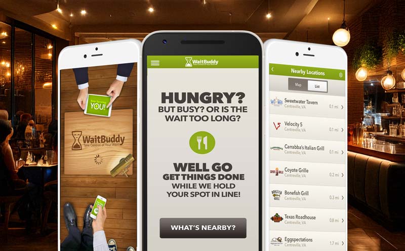
We softened the brand, product, and overall experience by replacing a harsh red-on-green experience with toned down earthy palette, introducing a more gender-neutral mark, and adding a concise tagline that clarified the app’s purpose at a glance.
Logo & Identity
The rebrand sought to convey a sense of approachability and environmental consciousness that would appeal to foodies of all types, but mainly women 24-50. To achieve this, we replaced the existing male focused 'buddy' and harsh red tones with a welcoming and less masculine hourglass mascot/logomark and earth tones. This new symbol not only signifies the friendly assistance provided by the app but also highlights the enjoyable free time users gain by efficiently managing their wait periods.
Before

After

Business Card
By redesigning the old logo, swapping the vibrant red with the desired earthy palette, rounding the corners slightly and adding a tagline, the brand and accompanying collateral made more sense at a glance and felt more approachable and environmentally friendly.
Before


After


Before
After

Before

After

Before

After

Before

After

Before

After

Before

After

Before

After


More Samples Available…